
July 25, 2026
Why Precious Metals Pricing Is More Misunderstood Than Almost Any Other Asset Class
The history of commodity markets is littered with examples of structurally important price moves that investors missed entirely because they were applying the wrong analytical framework. Copper traded in a narrow band for decades before quadrupling in the span of a few quarters. Lead did the same. In both cases, the breakout had nothing to do with a single catalyst and everything to do with the exhaustion of a structural ceiling that had suppressed the price for far too long. Understanding why those moves happened, and recognising when a similar dynamic is building in another market, is one of the most valuable skills any investor can develop in 2025.
Silver and gold sit at the intersection of monetary history, industrial demand, and macro regime change. Yet the prevailing narratives around these metals remain cluttered with outdated assumptions, media-driven misconceptions, and analytical frameworks that simply do not hold up under historical scrutiny. Separating gold and silver market myths from what the data actually shows, particularly when building a credible silver price forecast, requires a more rigorous approach than most retail investors are ever offered.
When big ASX news breaks, our subscribers know first
The "Crisis Asset" Framing Misrepresents Gold's Primary Driver
Gold Has Been Rising Since 2015, Long Before Any Single Crisis
One of the most persistent gold and silver market myths is the idea that gold only performs during geopolitical or financial crises. This framing is not entirely wrong, but it is dangerously incomplete. Gold's bull market did not begin with any specific war, pandemic, or banking failure. It began from a structural low in December 2015 and has been appreciating for the better part of a decade.
The real driver of gold's long-term trend is purchasing power erosion within fiat monetary systems. Crisis events act as accelerants or catalysts, but they are not the engine. The engine is the structural debasement of paper currency through money supply expansion. When M2 money supply grows persistently faster than economic output, the relative value of hard assets appreciates in response. That process has been underway for over a decade, largely independent of any particular geopolitical headline. Understanding the gold bull market catalysts behind this sustained trend helps investors avoid the trap of timing entries around news cycles.
This distinction matters for investors because those who buy gold purely on crisis headlines often enter at the wrong time, typically after the spike, and exit prematurely when the immediate news cycle fades. Those who understand the monetary debasement thesis buy systematically and hold through noise.
The long-run appreciation of gold is not a response to fear, but a mechanical consequence of fiat currency systems that structurally expand the money supply faster than they create real economic value.
Why Geopolitical Headlines Are a Poor Timing Tool
When armed conflict broke out in early 2024, many investors expected gold to surge sharply on gold as a safe haven demand. Instead, gold's trend continued on its pre-existing trajectory, largely unaffected by the headline. This is consistent with historical patterns. Gold and silver had already established their directional trends before any conflict-driven buying entered the market.
Investors who timed entries based on geopolitical catalysts often found themselves chasing a move that was already priced in, or worse, buying into a short-term spike that reversed quickly. The analytically sound approach is to position based on monetary and structural conditions, not news cycles. The war was, as one prominent technical analyst noted in relation to gold's trend since 2015, simply a hiccup in route.
Do Interest Rate Hikes Actually Hurt Gold? Separating Nominal From Real
The Critical Distinction That Most Investors Overlook
The claim that rising interest rates are bearish for gold is one of the most widely cited and most consistently misapplied ideas in financial commentary. The confusion arises from conflating nominal interest rates with real interest rates, and these are not the same thing.
| Metric | What It Measures | Relationship to Gold |
|---|---|---|
| Nominal interest rate | Stated central bank policy rate | Weak, inconsistent correlation |
| CPI / PPI inflation | Consumer and producer price changes | Strong inverse correlation |
| Real interest rate | Nominal rate minus inflation | Primary driver of gold direction |
| Negative real rate | Inflation exceeding the nominal rate | Historically the most bullish condition for gold |
The historical record is unambiguous. During the late 1970s, the US Federal Reserve was raising rates aggressively, and gold appreciated dramatically during the same period. The Fed funds rate and gold prices rose simultaneously, not in opposition. What was happening during that period? Inflation was running hot, real interest rates were negative or deeply compressed, and the purchasing power of cash was eroding faster than the interest it earned.
The same dynamic is forming now. Official inflation data shows acceleration in both CPI and PPI, with the producer price index serving as a leading indicator for consumer prices approximately two to three months ahead. Meanwhile, the gap between the T-bill rate and the inflation rate has compressed to near zero. Real rates are approaching, and in some measures already at, zero. Historically, this is the entry point for a structurally supportive gold environment. Furthermore, negative real rates — the next phase if inflation continues to outpace rate increases — have historically been the most bullish condition of all for precious metals.
The Structural Constraint on Rate Hikes
There is a deeper reason why aggressive rate hiking cycles are unlikely to persist in the current environment. The US government's debt load is growing at approximately 8.23% per year in nominal terms. A substantial portion of that debt was issued when rates were near zero, with yields on 10 and 15-year bonds sitting at roughly 1% to 1.5%. Those bonds are now rolling over at current market rates of approximately 4.5%, representing a multi-hundred percent increase in the interest burden on that portion of the debt.
The Congressional Budget Office's long-range projections confirm that interest expense as a percentage of GDP is rising rapidly and is forecast to continue doing so. This creates a structural constraint: the Fed cannot aggressively tighten monetary policy without triggering a sovereign bond market crisis that would dwarf the mortgage-driven stress of 2007 to 2009. Consequently, the gold and bond dynamics at play in this environment are fundamentally different from prior tightening cycles.
If rate hikes are constrained by the fiscal arithmetic of sovereign debt servicing, then the real rate environment is likely to remain suppressed or negative, which is structurally positive for gold and silver over any medium to long-term horizon.
Is Gold in a Bubble? What the Ownership Data Actually Shows
The Logical Error in the "High Price Equals Bubble" Argument
A bubble requires broad participation, speculative excess, and saturation of ownership across retail and institutional investors. None of those conditions currently exist in the precious metals market. Estimated gold allocations across global discretionary investment portfolios sit at below 1%. For context, the dot-com equity bubble of the late 1990s and the US residential real estate bubble of 2005 to 2007 were both characterised by widespread retail and institutional participation, with ownership levels and leverage far beyond what exists in gold today.
Higher prices do not, on their own, constitute a bubble. A price can be structurally supported by fundamentals and still appear high relative to historical levels. The more relevant question is not whether gold is expensive in nominal terms, but whether it is owned at levels consistent with speculative excess. The evidence suggests it is not.
Central Bank Accumulation as a Long-Term Signal
The European Central Bank recently confirmed that gold has surpassed US Treasuries as the leading global reserve asset. This is not a sudden development but the culmination of a sustained trend. Central banks, particularly those in economies seeking to reduce their exposure to single-currency reserve concentration, have been consistent net buyers of gold. The growth in reserves reflects both ongoing volume accumulation and the appreciation in price, creating a compounding effect on the value of national gold holdings.
This pattern is analytically significant. Central banks are not speculative actors. Their accumulation decisions reflect long-term strategic reserve management, not short-term trading. Sustained buying at this institutional level represents structural demand, not a bubble signal.
When Central Banks Sell: Emergency Liquidity, Not Bearish Sentiment
Headlines about central bank gold sales can be misread as a bearish signal for the metal. Turkey sold gold during a period when its currency was under severe stress from inflation rates running well above 35% by official estimates, and considerably higher by many independent assessments. India's central bank reportedly sold approximately $12 billion in gold over a two-week period to support the rupee. These are acts of emergency liquidity management, not strategic exits from gold as an asset class.
The historical parallel is instructive. The UK sold a significant portion of its gold reserves in the late 1990s at approximately $250 to $300 per ounce, a decision widely regarded as a generational pricing error and now commonly referred to as the Brown Bottom. Emergency asset liquidation under currency stress does not reflect a negative structural view of the asset being sold. In many cases, it signals the severity of the monetary stress itself, which is ultimately a bullish condition for hard assets.
The Silver Price Forecast: Why This Metal Is Structurally Positioned for a Multi-Decade Breakout
The 50-Year Price Ceiling and What It Means for the Next Move
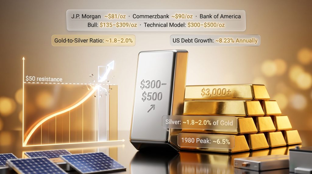
Silver's price history contains one of the most analytically unusual features of any traded commodity. For more than 50 years, silver was capped in the range of roughly $4 to $50 per ounce, with the top of that range tested in 1980 and again in 2011 without a sustained breakout. Both times, silver hit $50 and reversed. This multi-decade price ceiling has no equivalent in gold, which broke above each successive bull market high and continued to new territory.
The analytical framework for understanding what happens when a commodity finally breaks out of a decades-long trading range comes from two instructive precedents: copper and lead.
- Copper traded in a range of approximately $0.50 to $1.50 per ounce for decades before breaking out in late 2005. Within several quarters, it quadrupled in price and established a new structural range averaging approximately $3.50 to $4.00 that persisted for years.
- Lead underwent a comparable dynamic in 2010, with no significant headline catalyst. It also quadrupled in price within several quarters after emerging above its long-term range ceiling.
Both moves followed the same logarithmic logic: the magnitude of the prior range, applied above the breakout point on a ratio scale chart, projected the approximate destination of the new price reality. For silver, with a range from roughly $4 to $50 representing a roughly tenfold span, the same logarithmic projection applied above the $50 breakout level targets a range consistent with $300 to $500 per ounce.
The Silver-to-Gold Ratio: A Quantitative Case for Undervaluation
The gold-silver ratio analysis provides a historically grounded framework for assessing relative value between the two metals. At the peak of each of the two prior bull markets, silver's relationship to gold tells a consistent story.
| Period | Silver Price | Gold Price | Silver as % of Gold Price |
|---|---|---|---|
| 1980 bull market peak | ~$50/oz | ~$850/oz | ~6.5% |
| 2011 bull market peak | ~$50/oz | ~$1,920/oz | ~3.1% |
| 2025 (current) | ~$30-35/oz | ~$3,000+/oz | ~1.8-2.0% |
At current levels, silver represents less than 2% of the gold price. For it to return to the ratio it held at the 2011 peak of 3.1%, at today's gold price, silver would need to trade considerably higher than it does now. For it to return to the 1980 ratio of 6.5%, the implied price at current gold levels would exceed $150 per ounce. These are not speculative projections. They are mathematical relationships derived from historical precedent, and they suggest silver is historically undervalued relative to gold by any prior bull market standard.
Momentum Structure and the Breakout Signal
Technical momentum analysis, specifically long-term momentum indicators plotted independently of price, showed silver breaking out relative to gold in November of the prior year. Even through subsequent short-term price corrections, the long-term momentum structure remained intact. This is a characteristic feature of structural bull markets: momentum leads price, and short-term pullbacks do not damage the underlying directional signal on longer timeframes.
The current setup on momentum charts, as described by long-term technical practitioners, resembles what is commonly called a triple top breakout on momentum. Historically, each successive test of a resistance level on a momentum chart weakens that resistance, and the third test tends to resolve decisively to the upside, often with considerable force.
Silver Price Forecast 2025 to 2030: Institutional Projections and Scenario Analysis
What Major Research Houses Are Projecting
Institutional silver price forecasts span a wide range, reflecting genuine uncertainty about the pace and sequencing of the macro and industrial demand drivers. According to analysts at BlackRock, volatility in both metals is expected to remain elevated as macro conditions evolve.
| Forecast Source | Silver Price Target | Timeframe | Primary Basis |
|---|---|---|---|
| J.P. Morgan | ~$81/oz average | 2026 | Institutional macro model |
| LBMA Analyst Survey | ~$79.57/oz average | 2026 | Consensus survey (range: $42-$165) |
| Commerzbank | ~$90/oz | End-2026 | Commodity research |
| Commerzbank | ~$95/oz | End-2027 | Extended commodity model |
| Bank of America (bull scenario) | $135-$309/oz | Multi-year | Supply shortage intensification |
| Logarithmic range breakout model | $300-$500/oz | Multi-year | Copper/lead breakout precedent |
| CoinCodex (bearish model) | ~$45.77/oz | End-2026 | Quantitative regression |
Scenario Drivers Across Outcomes
Bull Case ($90 to $300+ per ounce):
- Real interest rates turn negative as inflation re-accelerates beyond the rate of policy tightening
- Industrial demand from solar photovoltaic manufacturing and EV systems compounds an already structural supply deficit driven by silver supply deficits that have persisted for several consecutive years
- Financial sector stress triggers capital rotation out of equities and bonds into monetary metals
- The silver-to-gold ratio mean-reverts toward historical norms, compressing the relative undervaluation
Base Case ($70 to $90 per ounce):
- Moderate inflation, relatively stable rates, steady industrial demand growth
- Gradual institutional portfolio reallocation toward precious metals over a 12 to 24-month horizon
- Central bank accumulation continues without acceleration
Bear Case ($40 to $55 per ounce):
- A significant strengthening of the US dollar broadly suppresses commodity prices
- Global industrial production slows materially, reducing solar and EV manufacturing demand
- Speculative long positions unwind sharply on macro disappointment
Risk Disclosure: Silver is one of the most volatile assets in the commodity universe. Corrections of 20% to 40% within structurally intact bull markets are historically normal. These pullbacks do not, on their own, invalidate long-term structural trends.
The next major ASX story will hit our subscribers first
The XLF Signal: What the Financial Sector Is Telling the Broader Market
Reading the Spread Chart That Almost Nobody Is Watching
Dividing the price of the XLF financial sector ETF — which encompasses banks, broker-dealers, insurance companies, and credit card operators — by the S&P 500 and plotting the result as a spread chart produces one of the most useful leading indicators available to macro investors.
In 2006 and 2007, this spread began deteriorating months before the financial crisis became visible in headline indices. When the S&P 500 made a new all-time high in September and October of 2007, the XLF did not confirm that high. The spread chart then broke through a structural floor, a signal that the financial sector was weakening relative to the broader market. That breakdown preceded the most severe phase of the 2007 to 2009 crisis by six to nine months. The current spread chart of XLF versus the S&P has recently broken through a multi-decade support level, and the current deviation is described by technical analysts as more exaggerated than the 2007 signal, not less.
Three Transmission Mechanisms Driving Financial Sector Stress
-
Commercial real estate refinancing: Fixed-rate commercial property loans originated at 3% to 5% over the past decade are now rolling over at 7% to 9%. Even accounting for rent growth of approximately 30% over five years, the financing cost increase of over 100% has more than offset income growth. Property owners facing forced refinancing at materially higher rates are experiencing significant valuation compression on their assets, creating potential impairment risk on bank balance sheets.
-
Private credit market exposure: Multiple financial institutions have lent into the private credit market, which is showing signs of stress as the interest rate environment tightens credit conditions for leveraged borrowers.
-
Consumer credit delinquency: Credit card debt delinquency rates serve as a tertiary stress indicator, reflecting the deterioration in household balance sheets that typically precedes broader consumer credit deterioration.
When financials lead the broader market lower, history suggests the destination is a macro dislocation that redirects capital toward monetary metals and hard commodity-linked assets.
Rethinking Portfolio Construction: The Case for Gold Allocation at Every Wealth Level
The 60/40 Portfolio's Structural Weakness
The traditional 60% equity / 40% bond allocation was designed for an environment characterised by positive real interest rates, moderate debt levels, and reliable bond performance as a portfolio counterweight. That environment has fundamentally changed. In a negative real rate world with sovereign debt under structural stress, bonds no longer provide the diversification benefit they once did.
A growing body of quantitative evidence supports replacing a portion of the bond allocation with gold. Specifically, replacing 20% of the bond allocation with gold — creating a 60/20/20 portfolio framework — has been shown to improve compound annual growth rates, Sharpe ratios, and maximum drawdown metrics across every historical measurement period since 1971. Adding gold improves risk-adjusted returns. According to research from Finance Magnates, expert projections for gold and silver prices in the years ahead continue to support the case for meaningful precious metals allocations within diversified portfolios.
A Practical Framework for Investors Across Wealth Levels
Gold is sometimes perceived as an asset accessible only to wealthy investors. At roughly $3,000 to $5,000 per physical coin, the entry cost is meaningful but not exclusive. Silver provides a fractional alternative with a lower unit cost that allows incremental accumulation over time. For investors who want liquid market exposure, miner ETFs provide leveraged participation in metal price movements.
| Asset Category | Current Signal | Investment Rationale |
|---|---|---|
| Physical gold | Structurally bullish | Direct monetary hedge, no counterparty risk |
| Physical silver | Accelerating bull | Industrial + monetary demand convergence |
| GDX (gold miners ETF) | Bullish momentum | Cash flow generation at elevated gold prices |
| SIL (silver miners ETF) | Bullish momentum | Leveraged upside exposure to silver |
| XME (base metals miners ETF) | Multi-year bullish | Copper-led commodity supercycle |
| US Treasuries | Cautious | Yield pressure, rolling refinancing risk |
| XLF (financial sector ETF) | Bearish signal | Spread breakdown, commercial real estate stress |
| RWR (commercial real estate) | Cautious | Decade of flat performance, refinancing cliff |
For investors carrying high-interest consumer debt, the priority should be reducing that obligation before concentrating capital in any asset. However, the case for gradual, systematic accumulation of physical metals is not undermined by moderate levels of low-interest mortgage debt. The key principle is incremental positioning rather than concentrated entry, preserving both financial flexibility and exposure to the structural trend.
What Fiat Currency History Actually Tells Us
The Evidence From Currencies That No Longer Exist
Physical collections of historical banknotes offer a visceral illustration of where fiat currency experiments have repeatedly ended. Currencies from Brazil, Argentina, Turkey, and Zimbabwe all share a common pattern: periods of apparent stability followed by accelerating denomination inflation, reissuance, and eventual collapse.
Turkey's currency, for example, began with modest single-unit denominations and progressed through thousands, then millions, before eventually requiring reissuance. Argentina's peso has gone through multiple reissuances, each preceded by a period during which markets believed the situation was manageable. The common thread across every case is governments using monetary expansion to service debt obligations, a practice that compounds over time until the system can no longer absorb the debasement.
The 54-Year Performance Record of the US Dollar Since 1971
The US dollar has been operating as a fully fiat currency since the end of the Bretton Woods gold standard in 1971. Over the subsequent 54 years, the dollar's purchasing power has declined materially relative to gold. Goods priced in gold terms have remained broadly stable across centuries. Goods priced in dollars have become substantially more expensive in real terms. Wealthy family offices and sovereign wealth funds maintain significant gold allocations precisely because this relationship is not new. It is the documented, centuries-long performance record of hard money versus managed currency.
Purchasing power anchored in gold has demonstrated century-scale stability. Purchasing power anchored in any modern fiat currency has demonstrated century-scale erosion. This is not a prediction. It is the historical record.
Frequently Asked Questions: Gold and Silver Market Myths Addressed
Does rising oil price hurt gold and silver miners?
At current gold prices above $3,000 per ounce, energy costs represent the smallest percentage of mining production economics in the industry's recorded history. When gold was trading at $1,200 and oil was near $140 per barrel, the cost burden on miners was considerably more acute than it is today. Miner cash flow generation at current metal prices is substantial, and energy cost fluctuations, while relevant, do not structurally threaten profitability at these metal price levels.
What is the gold-to-silver ratio and why does it matter for the silver price forecast?
The gold-to-silver ratio measures how many ounces of silver are required to purchase one ounce of gold. At historical bull market peaks, silver has represented between 3.1% and 6.5% of the gold price. At current levels near 1.8% to 2.0%, silver is at its lowest relative value to gold in any prior bull market cycle, suggesting significant catch-up potential on a purely ratio-based analysis.
Should investors prioritise physical metal or ETF exposure?
Physical metal provides direct ownership with no counterparty, custodial, or institutional risk. ETFs provide liquidity and fractional access but introduce layers of financial intermediation. Most preservation-focused frameworks recommend a core physical holding as the primary position, supplemented by miner ETFs for leveraged participation in metal price movements. Insured vault storage across multiple jurisdictions, including Singapore, the Cayman Islands, Zurich, and Canada, is increasingly accessible to international investors seeking secure physical custody outside their home country.
Is a US gold revaluation a realistic scenario?
The mechanics are historically precedented. A sale-and-repurchase arrangement between the US Treasury and the Federal Reserve, with gold revalued at a significantly higher price, would allow the Treasury to issue the Federal Reserve perpetual, non-interest-bearing gold notes. The net effect would be a reduction in the nominal debt burden while the government retains its physical gold. To achieve a reduction of several trillion dollars in debt, the revaluation price would need to be in the range of $10,000 to $15,000 per ounce. Whether this is pursued depends on political will and the pace at which the fiscal constraint becomes acute.
What would trigger a material silver price correction within a bull market?
A significant strengthening of the US dollar, a sharp deceleration in global industrial production particularly affecting solar and EV manufacturing, or an aggressive unwinding of speculative long positions could each produce corrections in the range of 20% to 40%. These events are historically normal within structurally intact bull markets and do not, on their own, invalidate the underlying trend. Investors who understand this are better positioned to hold through volatility rather than exit at precisely the wrong moment.
Key Takeaways for Investors Navigating Gold and Silver in 2025
Understanding the real drivers behind gold and silver pricing — rather than the simplified narratives that dominate financial media — is the prerequisite for making well-positioned decisions in the current environment. The most persistent gold and silver market myths, from the idea that rate hikes kill gold to the belief that central bank sales are bearish signals, collapse under even modest historical scrutiny.
The silver price forecast case rests on converging structural forces: a 50-year price ceiling that has now been broken, a supply-demand deficit that has persisted across multiple years, an industrial demand base that is growing structurally through solar and EV manufacturing, and a monetary environment characterised by real rates approaching zero or below. Institutional projections span from approximately $80 per ounce to over $300, with the upper end of that range supported by the same logarithmic breakout logic that correctly projected copper's and lead's post-range moves.
For investors at any wealth level, the practical implication is not to wait for perfect clarity or a single confirming event. It is to recognise that structural monetary transitions move gradually, then accelerate sharply, and that positioning established before the acceleration phase captures the majority of the available return.
Want to Know When the Next Major Mineral Discovery Hits the ASX?
Discovery Alert's proprietary Discovery IQ model scans ASX announcements in real time, delivering instant alerts on significant mineral discoveries — including precious metals opportunities — so investors can act before the broader market catches on. Start your 14-day free trial at Discovery Alert today, or explore the discoveries page to see how historic finds have generated extraordinary returns for early-positioned investors.