
May 16, 2026
The Fault Line Beneath the World's Largest Financial Market
The global bond market does not make headlines the way equities do. There are no dramatic IPOs, no viral earnings calls, no celebrity CEOs driving sentiment. And yet, at roughly $130 trillion in outstanding debt, sovereign bond markets form the very foundation upon which modern finance is built. They underpin pension fund solvency, serve as collateral for bank reserves, and anchor the so-called "risk-free" benchmark that every other asset class is priced against.
When that foundation shifts, the consequences do not stay contained. They ripple outward across every layer of the financial system, from retirement portfolios to currency valuations to the cost of a mortgage. What is increasingly apparent to a small but growing circle of analysts and institutional allocators is that the government bond crisis and gold and silver prices relationship could produce consequences unlike anything seen in modern financial history.
When big ASX news breaks, our subscribers know first
Why Sovereign Debt Is the Overlooked Pressure Point of This Decade
The Difference Between a Cyclical and a Structural Problem
Cyclical debt problems are manageable. A recession causes tax revenues to fall, deficits to widen, and debt-to-GDP ratios to rise temporarily. When growth resumes, the ratios normalise. Structural debt problems are different in kind, not just degree. They occur when the rate of debt accumulation consistently outpaces the economy's capacity to service it, regardless of the economic cycle.
Over the past several decades, major developed economies, including the United States, Japan, the United Kingdom, and much of the European Union, have been accumulating debt at precisely this structural pace. According to analysis on how government debt affects gold and silver, this dynamic has historically been a reliable long-term driver of precious metals appreciation.
What makes the current environment particularly consequential is the combination of factors converging simultaneously: multi-decade high yields on long-dated government bonds, central banks that have already exhausted much of their conventional policy capacity, and a bond market that has been in a technical downtrend in price terms since 2020. The 40-year bull market in bonds that began in the early 1980s is broadly understood to have ended.
The U.S. Treasury Market at a Critical Technical Juncture
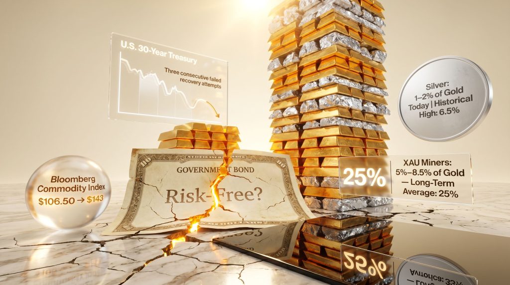
The U.S. 30-year Treasury bond market has made three consecutive failed attempts to establish a sustainable price recovery over the past three years. Each rally has failed to hold, yields have remained elevated, and T-bond futures have drifted back toward multi-decade lows. This pattern suggests the effort to establish a price floor has failed, and that yields are likely to press through their recent highs.
Even active central bank intervention has not reversed this dynamic. The Federal Reserve's New York branch publicly signalled bond purchases as recently as late 2024, characterising the activity as a liquidity provision measure rather than an explicit price defence. Yet T-bond prices have continued to drift lower. When market pressure consistently overcomes stated intervention, the analytical signal is clear.
| Warning Signal | What It Indicates | Current Status |
|---|---|---|
| Three consecutive failed bond price rallies | Underlying selling pressure dominates | Confirmed across U.S. 30-year T-bond futures |
| Central bank purchases failing to stabilise prices | Intervention capacity insufficient | Fed bond-buying has not reversed decline |
| Yields pressing toward multi-year highs | Long-term trend is bearish for bond prices | U.S. 30-year yields approaching multi-decade resistance |
| Institutional abandonment of 60/40 portfolio model | Safe-haven status of bonds questioned | Morgan Stanley CIO publicly proposed 20% gold allocation |
Japan as a Leading Indicator for the Developed World
Japan's bond market offers an instructive precedent. The Bank of Japan has explicitly committed to unlimited bond purchases to defend yield levels on Japanese government bonds, a policy that requires continuous currency creation to absorb domestic sovereign debt. The country's new prime minister acknowledged publicly that the policy of printing to defend the bond market would continue indefinitely.
This dynamic, where a central bank must manufacture currency at an accelerating rate simply to prevent its own sovereign debt market from dislocating, is increasingly being examined as a potential template for larger economies. If the United States were to enter a similar dynamic, the global consequences would be orders of magnitude more significant given the U.S. dollar's reserve currency status.
What a Government Bond Crisis Actually Looks Like
Beyond the Textbook Definition
A government bond crisis occurs when investors lose confidence in a sovereign government's ability to service its debt, causing bond prices to fall sharply, yields to rise uncontrollably, and borrowing costs to spiral, often forcing central banks into emergency intervention.
This process does not typically announce itself through dramatic events. It develops quietly through the accumulation of failed recovery attempts, gradually widening yield spreads, and the slow repositioning of large institutional portfolios away from sovereign debt. Furthermore, by the time bond market stress becomes a mainstream financial headline, the structural deterioration is typically well advanced.
JPMorgan's chief executive made remarks at a conference in Norway indicating that a government bond crisis was approaching and that it would need to be confronted in the near term. That public assessment from one of the world's largest financial institutions aligns closely with technical readings from momentum-based analytical frameworks, with both the fundamental and technical evidence pointing in the same direction simultaneously. Notably, Business Insider has reported on growing institutional warnings around sovereign debt and gold's response.
The Collapse of the 60/40 Model and Its Significance
The traditional 60% equity, 40% bond portfolio allocation rested on a crucial assumption: that bond prices would rise when equity markets fell, providing a natural hedge against drawdowns. This assumption held broadly during the multi-decade bond bull market. However, it breaks down structurally when sovereign bonds are themselves the source of systemic risk.
The Chief Investment Officer of Morgan Stanley publicly repudiated the 60/40 framework in recent months, proposing a revised allocation that includes a 20% position in gold as a genuine diversifier. When senior figures at institutions of this scale publicly reject foundational portfolio construction principles that have governed trillions of dollars in capital for decades, it signals a meaningful structural repositioning. Furthermore, the relationship between gold and bonds across economic cycles supports this rethinking of traditional allocation models.
- The 60/40 model assumed bonds would appreciate during equity downturns, providing a built-in stabiliser
- In a sovereign debt crisis, both equities and bonds can decline simultaneously, eliminating the hedge
- Some analysts argue gold allocations should be considerably higher than the 20% threshold now entering institutional conversation
How Gold Responds to Fiscal Deterioration
The Monetary Logic Driving Gold's Long-Term Performance
A common misconception about gold is that it rises primarily because of geopolitical uncertainty. Wars, elections, and international tensions drive headlines, but they do not drive gold's long-term price trajectory in any systematic way. What does drive gold's purchasing power preservation, measured across decades, is the mathematical certainty of ongoing fiat currency debasement.
As central banks expand money supply to meet fiscal obligations, to defend bond markets, to stimulate growth, or to manage unemployment, each unit of currency represents a progressively smaller claim on real goods and services. Gold, with a supply that grows at roughly 1-2% per year regardless of policy decisions, maintains its real value relative to currencies being expanded at multiples of that rate.
Consider the following illustration of monetary debasement: a median U.S. home cost approximately $4,500 for a previous generation, $45,000 for the generation that followed, and now exceeds $450,000 in median price terms. The house itself has not increased tenfold in value. The purchasing power of the monetary unit in which it is priced has declined by approximately that magnitude. Gold has tracked this debasement consistently.
What Quantitative Easing Has Consistently Done to Gold
History provides a clear and repeatable pattern. When central banks respond to financial crises with aggressive monetary expansion, the government bond crisis and gold and silver prices relationship becomes increasingly direct, with gold benefiting significantly while equities often continue to decline.
| Crisis Period | Central Bank Response | Gold's Behaviour | Equity Market Behaviour |
|---|---|---|---|
| 2001-2003 Dot-com bust | Aggressive rate cuts beginning early 2001 | Multi-year bull market commenced | NASDAQ 100 fell 85% despite rate cuts |
| 2007-2009 Mortgage crisis | Rate cuts plus QE introduced late 2008 | Surged back to prior highs almost immediately after QE began, then doubled to near $2,000 by 2011 | S&P 500 fell 50% over two years despite intervention |
| 2020-2022 COVID expansion | Largest peacetime money supply expansion in history | Hit all-time highs with direct correlation to M2 growth | Initially rebounded sharply before the 2022 correction |
The pattern reveals something important: quantitative easing does not reliably rescue equity markets once a structural bear market has taken hold. Capital that exits a deteriorating equity market during a period of monetary expansion tends to flow toward assets that benefit from that expansion. In addition, gold in volatility periods has demonstrated a consistent ability to preserve and grow purchasing power while other assets struggle.
The Eightfold Gain Framework for Gold
Looking back across gold's two major bull markets of the past fifty years, each originated from a significant bear market low and produced an eightfold gain before the peak was reached. The 1980 peak of approximately $850 per ounce represented an eightfold gain from the preceding bear market low. The 2011 peak of approximately $1,920 per ounce represented a similar magnitude of gain from the 2001 bear market low.
The most recent bear market in gold concluded in 2015 at approximately $1,050 per ounce. An eightfold gain from that base implies a target in the vicinity of $8,400 per ounce. At gold's current price of approximately $4,700, that trajectory is roughly half complete. JPMorgan's own fundamental analysis has produced a comparable figure of approximately $9,200 per ounce, suggesting institutional modelling is arriving at similar conclusions through different methodologies.
Why Silver May Be the Most Undervalued Asset in the World
Fifty Years of Price Suppression and What Happens Next
Silver occupied a price range of roughly $4 to $50 per ounce for approximately half a century. This is an extraordinary observation. While gold was making new highs across multiple bull market cycles, while copper and lead were breaking out of similar multi-decade ranges and tripling in price, silver remained capped within its historical band.
There are arguments, supported by documented evidence of institutional positioning, that this range represented artificial price containment by large financial interests. Whether or not one accepts that framing, the market dynamic that follows when a commodity breaks out of a multi-decade range is well documented. Copper broke out of its $0.50 to $1.50 range in late 2005 and tripled within several quarters, establishing a permanently higher trading range roughly three times the prior average.
Silver broke out of its fifty-year range in late 2024, surging to levels above $100 per ounce before entering a period of violent consolidation. Based on the copper and lead precedents, the structural target for silver's new range sits in the region of $300 to $500 per ounce.
| Metal | Prior Range | Breakout Behaviour | Post-Breakout Reality |
|---|---|---|---|
| Copper | $0.50-$1.50 for decades | Tripled within several quarters of breakout | Permanently established new range ~3x prior average |
| Lead | Similar multi-decade range | Replicated copper's pattern ~18 months later | Tripled-plus; new range established |
| Silver | $4-$50 for ~50 years | Broke out late 2024, surged above $100 | Congestion phase underway; structural target: $300-$500 |
Silver's Extreme Undervaluation Relative to Gold
Measuring silver's price as a percentage of one ounce of gold reveals an historically extreme undervaluation. The gold-silver ratio provides a durable analytical framework that is independent of absolute price targets and operates across different market conditions.
- At the 1980 gold peak, silver represented approximately 6.5% of the price of one ounce of gold
- At the 2011 gold peak, silver represented approximately 3.1% of the price of one ounce of gold
- In recent years, silver has traded as low as 1% of one ounce of gold, and currently sits near 1-2%
A recovery to merely the lower historical ratio of 3.1% would represent a massive percentage gain relative to gold. If gold were to reach $8,400, consistent with the eightfold gain framework described above, a recovery to 3.1% of gold's price would imply silver near $260 per ounce. A recovery to the 6.5% ratio observed at the 1980 peak would imply prices well above $500 per ounce.
Silver has been off the page cheap relative to gold for close to a decade when measured through relative performance analysis. The spread chart between silver and gold tells a story that price charts alone do not capture: an asset that has been disproportionately suppressed while the rest of the precious metals complex advanced.
The Current Congestion Phase and What It Signals
Following the surge above $100 per ounce in early 2025, silver entered a violent consolidation phase characterised by large swings in both directions. The late January 2025 collapse brought silver to approximately $66 by the first trading days of February, before a sharp recovery. A brief penetration below that low in late March was immediately reversed, a behaviour that technical analysts interpret as a stop-run rather than a genuine breakdown.
The current consolidation, when viewed against the fifty-year price history, is best understood as a congestion zone following an initial breakout. When the exit from this zone occurs, the directional move is likely to be rapid. Consequently, any onset of clearly visible government bond market distress could act as the catalyst that transforms an already developing precious metals rally into an acute demand surge.
Are Equity Markets Masking the Underlying Risk?
Why New Highs Are Not Incompatible With a Major Top
Major equity market peaks historically form during periods of apparent optimism, not obvious distress. The dot-com peak of early 2000 occurred while internet valuations were being celebrated as a permanent new paradigm. The 2007 mortgage crisis top occurred with equity indices still near all-time highs, well before the underlying credit deterioration became a mainstream concern. In both cases, the structural damage was present long before the market acknowledged it.
The current environment exhibits several characteristics consistent with a major topping process. Equity indices have made new all-time highs, sentiment among retail participants is optimistic, and the dominant narrative, in this cycle artificial intelligence, is capturing enormous capital allocation. The AI thesis may be entirely correct in its long-term transformative claims. However, the NASDAQ 100 still fell 85% between 2000 and 2002 as valuations disconnected from near-term earnings reality.
The Inflation-Adjusted Reality of Equity Performance
When the S&P 500's price performance since 2000 is measured against U.S. M2 money supply growth over the same period, the index has broadly preserved purchasing power rather than generated real wealth above monetary expansion. In real terms, adjusted for currency debasement, the S&P has largely been running in place for a quarter of a century.
Gold, measured against the same M2 growth rate since 2000, has substantially outperformed monetary expansion on a percentage basis. Furthermore, the gold-stock relationship across secular cycles reveals that these two asset classes frequently diverge in performance precisely during the periods when sovereign debt stress is most acute.
The next major ASX story will hit our subscribers first
Positioning for a Government Bond Crisis Scenario
The Mining Equity Opportunity: Understanding the XAU-to-Gold Ratio
The XAU gold and silver miners index has existed since the 1980s and provides a multi-decade dataset for measuring the relative value of mining equities against the metals they produce. Historically, the XAU index traded between 17.5% and 35% of the price of one ounce of gold, with a long-term average of approximately 25%.
Following the 2008 financial crisis, mining equities suffered a catastrophic collapse in relative performance. By 2014 and 2015, the XAU index had fallen to just 4% of the price of one ounce of gold, an extreme that represented the deepest undervaluation in the index's history. Since that low, miners have recovered into a new range of approximately 5% to 8.5% of gold's price, though this remains dramatically below the long-term historical average of 25%. The dynamics of gold and mining equities suggest this gap could close meaningfully as the government bond crisis and gold and silver prices narrative intensifies.
When the XAU-to-gold spread breaks above its current 5-8.5% range, momentum analysis suggests that mining equities could rapidly double in relative value to gold. This would represent not just leveraged exposure to a rising gold price, but a simultaneous compression of the valuation discount that has persisted for a decade.
Identifying Outperformers Within the Mining Sector
Standard balance sheet analysis becomes less reliable as a stock selection tool in a rapidly rising metal price environment. When gold moves from $3,000 to $5,000, earnings estimates for virtually every producer become obsolete within weeks. The more durable analytical framework involves measuring relative performance.
- Stocks breaking out relative to GDX on a multi-year relative performance chart have historically preceded significant price acceleration
- Relative performance breakouts, where a miner establishes a clear ceiling against GDX and then breaks above it, tend to produce sustained outperformance rather than brief spikes
- Silver miners, as a sub-segment, offer what may be the highest leverage in the entire complex: leveraged exposure to silver, which is itself leveraged to gold
The Spread Trade: A Market-Neutral Approach
For investors who hold a negative view on equities but are reluctant to take an outright short position, a spread trade provides an alternative framework. By pairing short equity exposure with long silver or gold positions, an investor captures the relative value gap between overvalued financial assets and undervalued monetary metals without taking a pure directional bet on either asset in isolation.
Even in a scenario where equities rise due to aggressive monetary expansion, silver's historical pattern of dramatically outperforming equities during debasement episodes means the spread could generate positive returns regardless of the equity market's absolute direction.
| Asset | Relative Valuation Status | Potential Upside Scenario |
|---|---|---|
| Physical Gold | Already in bull market | Eightfold gain from 2015 low implies ~$8,400 target |
| Physical Silver | Extreme undervaluation vs. gold | $300-$500 range based on historical ratio recovery |
| Gold Miners (GDX/XAU) | Significantly undervalued vs. gold | Potential to double in relative value to gold upon spread breakout |
| Silver Miners | Most undervalued segment of the complex | Leveraged exposure to silver's outperformance vs. gold |
| Broad Commodities | Historically cheap vs. equities | Multi-year advance supported by momentum breakout |
The Commodity Complex as a Structural Beneficiary
A Breakout That Preceded the Headlines
The Bloomberg Commodity Index broke out on momentum-based metrics in October, when prices were near $106.50. By the time oil-related geopolitical tensions generated mainstream financial media attention to the commodity sector, the index was already trading near $143, representing a gain of approximately 35% that occurred with minimal public awareness. This sequencing illustrates a recurring pattern in markets: institutional capital rotates into undervalued asset classes before the news cycle identifies the catalyst.
How to Build Commodity Exposure Without Leverage
The valuation gap between commodities and financial assets is large enough, when measured across multi-decade timeframes, that leverage is not required to generate meaningful returns. Unlevered exposure through:
- Broad commodity ETFs tracking the Bloomberg Commodity Index provide diversified exposure across energy, agriculture, and base metals
- Sector-specific equities in agriculture, base metals, and energy provide indirect commodity participation through listed companies with operational leverage to underlying prices
- Position sizing rather than leverage allows participation in the structural commodity advance without the risk of forced liquidation during periods of volatility
Could Gold and Silver Be Remonetised?
A Quiet Policy Shift at the State Level
A growing number of U.S. states have enacted legislation recognising gold and silver as legal currency, a development that explicitly challenges the federal government's monopoly over monetary instruments. This legislative trend is not yet mainstream in terms of scale or adoption, but its existence reflects a meaningful shift in the political and legal framing surrounding precious metals. Individual states effectively affirming the monetary status of gold and silver is a development without modern precedent in the United States.
Eastern Accumulation Patterns as a Signal
China has been accumulating gold at a pace that exceeds what is publicly reported through official channels, a pattern that multiple analysts have identified as consistent with a long-term strategic hedging of dollar exposure. India has been examining the role of silver as a monetary reserve asset. These accumulation patterns, when viewed alongside the domestic legislative trends in the United States, suggest that the remonetisation of precious metals is transitioning from a fringe theoretical argument into an active policy consideration.
The pathway to any form of remonetisation is unlikely to be a single dramatic policy announcement. It is more likely to be gradual, crisis-driven, and geographically uneven, occurring first in jurisdictions where the erosion of fiat currency credibility reaches a critical threshold before spreading more broadly.
FAQ: Government Bond Crisis, Gold, and Silver
Does a government bond crisis always cause gold prices to rise?
When sovereign bond markets come under sustained stress, gold historically benefits as investors seek assets outside the traditional financial system. The magnitude of gold's response depends on the severity of fiscal deterioration and the scale of central bank intervention required to address it. What is consistent across historical episodes is that the more aggressively a central bank is required to intervene, the more positive the environment for gold becomes, because intervention requires currency creation.
Why would silver outperform gold in a bond crisis scenario?
Silver amplifies gold's directional moves during monetary debasement episodes because it combines gold's monetary characteristics with additional industrial demand dynamics. More importantly, its current valuation relative to gold, at approximately 1-2% of gold's price versus a historical range of 3.1% to 6.5%, creates a mean-reversion opportunity of extraordinary magnitude that is independent of the broader macro environment.
What happens to equities if central banks monetise sovereign debt?
Historical evidence from the 2001-2003 and 2007-2009 episodes demonstrates clearly that aggressive monetary easing does not reliably support equity markets once a structural bear market is underway. The NASDAQ 100 fell 85% and the S&P 500 fell 50% during periods of sustained and aggressive central bank rate cuts. Capital that exits equities during these periods tends to flow toward assets that directly benefit from monetary expansion.
How does the 60/40 portfolio model break down in a bond crisis?
The 60/40 model assumes bonds appreciate when equities decline. In a sovereign debt crisis, both assets can fall simultaneously: equities due to deteriorating economic conditions, and bonds due to loss of confidence in sovereign creditworthiness. This correlation breakdown is precisely what has prompted senior institutional figures to advocate publicly for meaningful gold allocations as a genuine portfolio diversifier.
What is the wet bar of soap phenomenon in precious metals markets?
This term describes the price dynamics that occur when a previously overlooked asset class suddenly attracts urgent capital inflows. As investors scramble to acquire the asset, the lack of willing sellers at current price levels causes prices to rise sharply and rapidly. The asset effectively cannot be held at current prices as demand overwhelms available supply. This pattern has historically occurred in gold and silver during periods of acute financial stress, and the conditions that typically precede it are increasingly present in the current environment.
This article is for informational and educational purposes only and does not constitute financial or investment advice. All forecasts, price targets, and scenario projections discussed are speculative in nature and involve significant uncertainty. Past performance of any asset class does not guarantee future results. Readers should conduct their own independent research and consult a licensed financial adviser before making any investment decisions.
Want to Stay Ahead of the Next Major Mineral Discovery Driving Precious Metals Sentiment?
As sovereign debt pressures and precious metals narratives converge, Discovery Alert's proprietary Discovery IQ model delivers real-time alerts on significant ASX mineral discoveries, transforming complex geological data into actionable investment insights — explore historic discoveries and their extraordinary returns, then begin your 14-day free trial to position yourself ahead of the market.