
July 12, 2026
The Slow Erosion Nobody Talks About Until It's Too Late
Throughout recorded economic history, the most destructive wealth transfers have rarely arrived as sudden crashes. They arrive gradually, then all at once. Populations lose purchasing power incrementally through currency debasement, dismissing each percentage point of decline as manageable, until the cumulative erosion becomes undeniable. By that point, the window for repositioning has narrowed considerably.
This pattern has repeated across every major monetary system, from Rome's debasement of the denarius to the Weimar Republic's hyperinflation, from Argentina's 2001 peso collapse to Venezuela's bolivar implosion. In every case, those who stored wealth in the system's native currency suffered the most. Those who held physical gold and silver wealth protection assets preserved their wealth across the reset.
The question worth asking in 2025 and beyond is not whether this pattern will repeat, but how far along the current iteration already is.
When big ASX news breaks, our subscribers know first
The Macro Case for Hard Assets: Understanding the Structural Breakdown of Fiat Systems
How Every Major Monetary Reset Has Redistributed Wealth
The World Gold Council has documented 664 currency collapses since 1900, with the average currency surviving approximately 27 to 40 years before requiring reset or significant redenomination. The mechanism in nearly every case followed a predictable sequence: government expenditure outpaced revenue, deficits were financed by currency creation, purchasing power declined, foreign confidence eroded, and ultimately the currency was either abandoned, redenominated, or replaced.
Monetary historian Niall Ferguson has described this pattern in detail, noting that fiat currency collapses follow stages of monetary expansion, asset price inflation, loss of foreign confidence, capital flight, and eventual debasement or replacement. What distinguishes successful wealth preservation across these resets is not timing the collapse precisely, but rather positioning in assets that maintain intrinsic value independent of any government's fiscal decisions.
The U.S. dollar has lost approximately 96% of its purchasing power since the Federal Reserve's establishment in 1913, according to U.S. Bureau of Labor Statistics historical CPI data. That erosion did not happen overnight. It compounded quietly across 112 years, accelerating whenever fiscal conditions deteriorated.
Why the Current Cycle Carries Distinct Urgency
What differentiates the present moment from previous debt expansions is the combination of scale, velocity, and structural inflexibility. Past debt cycles, including post-World War II expansion and the deficits of the 1980s, occurred when debt-to-GDP ratios left meaningful fiscal headroom. Today, that headroom has been largely consumed.
Furthermore, the 2008 financial crisis was managed through emergency money creation from a relatively lower debt baseline. The same crisis management toolkit applied today would begin from a position of already-elevated leverage, compressing the margin of safety dramatically. Understanding gold as a strategic hedge becomes increasingly relevant in this context.
How Severe Is the U.S. Fiscal Position? A Data-Driven Breakdown
National Debt in Context: What the Numbers Mean Per Citizen and Per Taxpayer
The scale of U.S. sovereign debt is often cited but rarely contextualised in ways that connect to individual financial exposure. Current figures from the U.S. Department of the Treasury and Congressional Budget Office paint a picture that warrants serious attention.
| Metric | Figure | Source |
|---|---|---|
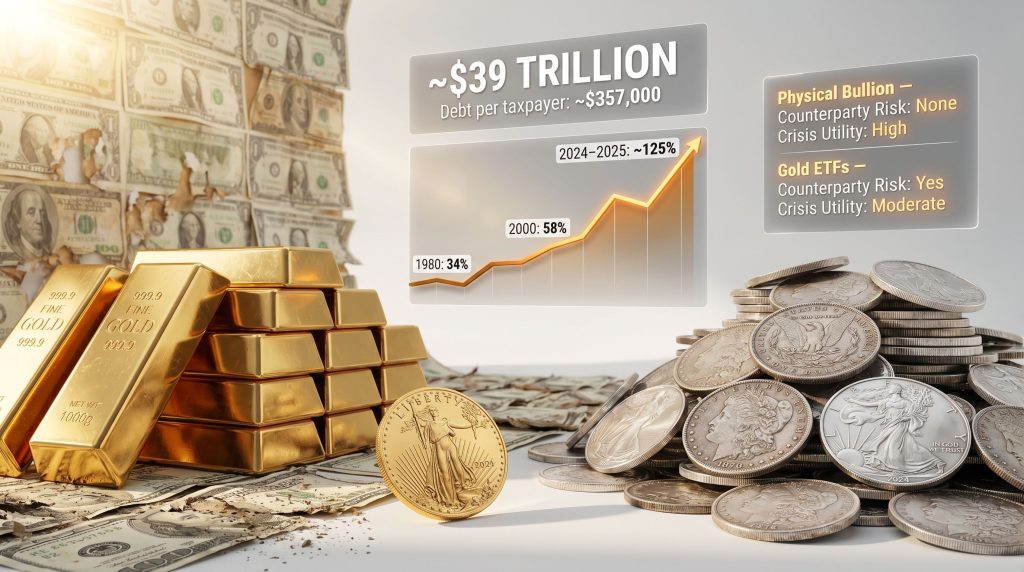
| U.S. National Debt | ~$39.7 trillion | U.S. Treasury, April 2026 |
| Debt per citizen | ~$119,000 | Calculated on 333M population |
| Debt per taxpayer | ~$357,000-$371,000 | IRS Statistics of Income, 2023 |
| Annual federal tax revenue | ~$5.34 trillion | Treasury Department, FY2025 |
| Annual federal spending | ~$7.1 trillion | Treasury Budget Execution, FY2025 |
| Annual deficit | ~$1.76 trillion | Treasury Department |
| Debt-to-GDP ratio | ~124%-126% | CBO, April 2026 |
The debt-per-taxpayer figure is particularly revealing. Not every U.S. citizen files a federal tax return. Distributed across the approximately 107 to 111 million individual filers documented by the IRS, the implied obligation per taxpayer reaches well above $350,000. While no government agency will knock on individual doors demanding that sum, it represents the structural liability underpinning every future fiscal decision, including tax rates, benefit levels, and monetary policy.
The Deficit Spiral: Why Spending Obligations Cannot Simply Be Cut
A common misconception is that the U.S. fiscal deficit could be resolved through political will and expenditure reduction. The structural reality is considerably more constrained.
-
Social Security covers 67.6 million beneficiaries as of 2025, according to the Social Security Administration. It is a legally mandated entitlement requiring congressional legislation to modify, and polling by Pew Research consistently shows approximately 75% of Americans oppose benefit reductions.
-
Medicare and Medicaid collectively serve over 130 million Americans. The Centers for Medicare and Medicaid Services report healthcare cost inflation averaging 4 to 5% annually, creating automatic spending escalation independent of policy choices.
-
Defense spending for FY2025 reached approximately $822 billion in base appropriations, with total national security costs approaching $1.1 trillion including supplementals.
-
Net interest on the national debt has reached $1.24 trillion for FY2025, according to Treasury Department budget execution reports. This represents a 575% increase in nominal terms from FY2008's $184 billion baseline, while GDP grew approximately 120% over the same period.
That last figure deserves particular emphasis. Annual debt service now exceeds the entire U.S. defense budget. It ranks as the third largest federal budget item, behind only Social Security and Medicare. The Congressional Budget Office has stated that if current fiscal policy continues unchanged, mandatory spending combined with interest payments will consume 100% of federal revenue by approximately 2050.
The Debt-to-GDP Alarm Bell: Historical Benchmarks vs. Today's Reality
Most mainstream economists identify 70% debt-to-GDP as the threshold beyond which sovereign debt begins to structurally destabilise an economy. The rationale is straightforward: beyond that level, debt service growth begins to crowd out productive investment, reduce policy flexibility, and signal increasing default risk to creditors.
The U.S. trajectory makes for uncomfortable reading when plotted historically, using Federal Reserve Economic Data (FRED) series:
| Year | U.S. Debt-to-GDP Ratio |
|---|---|
| 1960 | 52.7% |
| 1980 | 33.4% |
| 2000 | 58.0% |
| 2010 | 103.2% |
| 2020 | 127.0% |
| 2025 | ~124%-126% |
The pattern shows a ratio that was broadly manageable through 2000, then nearly doubled within a decade following the 2008 crisis response, and has remained elevated ever since. The current 124% to 126% figure sits at nearly double the widely cited danger threshold.
What Is a Debt Doom Loop and Are We Already Inside One?
Defining the Self-Reinforcing Cycle of Sovereign Debt Deterioration
A debt doom loop is not a theory. It is a mechanical sequence in which each stage of the fiscal cycle creates the conditions for the next, worsening with each iteration. The stages operate as follows:
-
Rising deficits require increased Treasury borrowing to finance the gap between spending and revenue.
-
Increased Treasury supply, at a time when foreign demand is declining, forces higher yields to attract buyers.
-
Higher yields increase the annual interest cost on the entire $39.7 trillion debt stock.
-
Elevated interest payments widen the deficit further, requiring additional borrowing.
-
Each cycle of this loop reduces fiscal flexibility, making corrective action progressively more difficult.
Evidence that this loop is already active is visible in Treasury yield data. The 10-year Treasury yield moved from 0.93% in January 2021 to approximately 4.25% to 4.35% by April 2026, according to U.S. Treasury daily yield curve data. Meanwhile, China's holdings of U.S. Treasuries have declined from a peak of approximately $1.3 trillion in 2013 to $783 billion in April 2026, a 40% reduction. Total foreign holdings as a share of circulating Treasury debt have declined from approximately 28% to 18-20% over the same period, based on Treasury International Capital (TIC) System data.
The practical consequence is that domestic buyers must absorb an increasing share of issuance, demanding higher compensation for the privilege.
The Interest Burden Tipping Point
The tipping point in any debt doom loop is reached when interest payments grow faster than economic output. At that stage, even robust GDP growth cannot generate sufficient tax revenue to stabilise the debt ratio.
Annual U.S. net interest payments reached $1.24 trillion in FY2025, representing approximately 23% of all federal tax revenue. Each 0.25% increase in average borrowing rates adds roughly $100 billion to annual interest costs. At a 5% average rate on the full debt stock, annual interest would approach $2 trillion.
Former U.S. Treasury Secretary Larry Summers has described the current environment as a fiscal dominance scenario, in which budget constraints begin overriding monetary policy effectiveness. When sovereign solvency becomes questioned, central banks progressively lose their ability to set borrowing costs through conventional rate policy.
Why a Crisis Event Would Be Structurally Different This Time
The contrast between fiscal headroom in 2008 versus today is significant. In 2008, U.S. debt-to-GDP was approximately 68%, providing considerable room for emergency stimulus. The government deployed approximately $700 billion through TARP and several trillion through Federal Reserve balance sheet expansion, from a relatively modest starting position.
Today, any comparable crisis response would begin from a 124% to 126% debt-to-GDP baseline. Emergency money creation would compound an already-stretched position, potentially accelerating the very loss of confidence it sought to prevent. Additionally, declining employment and business closures reduce future tax revenue capacity, narrowing the government's ability to service expanded debt from economic recovery alone.
The Hidden Risk Layer: $900 Trillion in Derivatives Exposure
Understanding the Scale of Systemic Leverage
Beyond the visible fiscal metrics lies a less-discussed layer of systemic risk embedded in the derivatives market. Derivatives are financial contracts whose value derives from an underlying asset, rate, or index. They include interest rate swaps, credit default swaps, currency forwards, and options contracts, among many others.
U.S. derivatives exposure is approaching $900 trillion, according to analysis of Bank for International Settlements (BIS) and Office of the Comptroller of the Currency (OCC) data. Critically, this figure likely understates the true number when off-balance-sheet instruments and private bilateral contracts are included. Some analyses suggest total global exposure may exceed $1 quadrillion.
Warren Buffett's characterisation of derivatives as financial weapons of mass destruction was not rhetorical. It described the chain-reaction mechanics embedded in layered, leveraged instruments. When the underlying asset of a derivatives stack loses value, losses propagate through every contract built above it, creating cascading failures that can exceed the original asset loss by orders of magnitude.
This is precisely the mechanism that nearly collapsed the global financial system in 2008, before emergency government intervention contained the damage. The critical observation is that derivatives exposure has not declined since 2008. It has continued to grow, now at a scale that dwarfs the conditions that preceded the prior crisis.
Bank Bail-Ins: The Legal Framework That Changes the Risk Profile
One consequence of the 2008 crisis that receives insufficient public attention is the legislative changes that followed it. Post-crisis regulatory reforms in the United States established legal frameworks permitting bail-in mechanisms, under which failing financial institutions can recapitalise using depositor funds under specific conditions.
This represents a structurally different risk profile compared to the 2008 model, where external government capital was injected into failing institutions. Under bail-in frameworks, depositors transition from creditors to involuntary equity providers. This is not hypothetical. The legal architecture is in place. Understanding this distinction is a core component of physical gold and silver wealth protection strategy, as physical bullion held outside the banking system is entirely insulated from bail-in risk.
The Purchasing Power Collapse: What the Data Says About Dollar Devaluation
M2 Money Supply Expansion and Real Wealth Erosion
The U.S. M2 money supply now stands at approximately $22 trillion, according to Federal Reserve H.6 release data. Approximately 30% of all U.S. dollars currently in circulation were created after 2020, correlating directly with documented purchasing power losses of 25 to 30% over the subsequent six years as measured by real consumer price data.
This is not coincidental. When currency supply expands faster than productive economic output, each unit of currency commands a smaller claim on real goods and services. The debasement is mathematical rather than theoretical. Consequently, gold's safe-haven role becomes ever more significant as these monetary pressures compound.
The Cost-of-Living Divergence: Income vs. Asset Prices
The divergence between income growth and asset price inflation since 2000 provides a concrete illustration of purchasing power erosion in practical terms:
| Metric | Year 2000 | 2024-2025 | % Change |
|---|---|---|---|
| Median household income | ~$31,764 | ~$51,971 | +64% |
| Median home price | ~$163,000 | ~$412,000 | +153% |
| Average new vehicle price | Significantly lower | ~$48,000+ | +100%+ |
The household income figure rose approximately 64% over 25 years. The median home price rose 153% over the same period. A first home that cost roughly five times annual median income in 2000 now costs nearly eight times median income. This structural affordability deterioration has contributed to a documented increase in the average age of first-time homebuyers.
The vehicle comparison is equally striking. In 2000, the median home price was approximately three and a half times the cost of an average new vehicle. Today, the average new vehicle costs more than a third of the median home value in 2000. The same dollars that represented accessible purchasing power in 2000 now represent constrained purchasing power relative to essential consumer goods.
Why Official Inflation Metrics Often Understate Real Cost-of-Living Pressure
Official CPI calculations use methodologies including substitution effects (assuming consumers substitute cheaper goods when preferred items become expensive) and hedonic adjustments (reducing measured price increases when product quality improves). These methodological choices tend to produce lower measured inflation than what households actually experience when purchasing the same basket of goods year over year.
This gap between official inflation metrics and lived purchasing experience is one reason gold and silver ratios against the 1913 dollar baseline provide a more transparent measure of long-run monetary debasement. For a broader view of how these dynamics play out across different precious metals, gold-silver ratio insights provide further analytical depth.
The next major ASX story will hit our subscribers first
How Does Physical Gold and Silver Protect Wealth?
Gold and Silver as Monetary Anchors: A 5,000-Year Track Record
Gold and silver have served as monetary stores of value across every major civilisation in recorded history. Their utility is not cultural sentiment. It derives from specific physical properties: finite supply constrained by geological scarcity, chemical stability, divisibility, portability, and resistance to counterfeiting.
These properties make them uniquely suited to preserving purchasing power across political and monetary system changes. No fiat currency in history has maintained its purchasing power over multi-generational timeframes. Physical gold and silver, by contrast, have maintained wealth-preserving function across the rise and fall of every monetary system they have coexisted with. According to Melbourne Mint's research on wealth preservation, this multi-millennial track record remains one of the most compelling arguments for including physical metals in any long-term strategy.
The Dollar-to-Silver and Dollar-to-Gold Ratios: Measuring True Inflation Since 1913
Using 1913, the year of the Federal Reserve's establishment, as a monetary baseline reveals the full scale of dollar debasement. In 1913, silver traded at approximately $2.68 per ounce and gold at approximately $27.82 per ounce. When adjusted using the dollar-to-precious-metals ratio, the inflation-adjusted monetary basis for silver approaches $1,258 per ounce and for gold approaches $10,000 per ounce.
These figures do not represent price predictions. They represent a mathematical measure of how much purchasing power has been created in dollar form relative to the constrained supply of physical monetary metals. The gap between current spot prices and these monetary ratios reflects, in part, the degree to which paper-denominated financial instruments have been substituted for actual metal in portfolios.
Gold vs. Silver: Different Roles Within a Wealth Protection Strategy
Gold and silver are complementary rather than interchangeable. Their distinct characteristics make them suited to different functions within a broader physical gold and silver wealth protection framework:
| Characteristic | Gold | Silver |
|---|---|---|
| Price stability | High, relatively low volatility | Moderate, more volatile |
| Primary function | Long-term wealth preservation | Liquidity and transactional utility |
| Industrial demand influence | Low | High, amplifies price movements |
| Ideal holding horizon | Decades | Medium-term and transactional |
| Portfolio role | Safe-haven anchor | Growth and diversification component |
Gold's lower industrial demand exposure means its price behaviour is more purely driven by monetary and safe-haven dynamics. Silver's substantial industrial demand, encompassing solar photovoltaic panels, electronics, medical applications, and electric vehicles, introduces an additional demand driver that can amplify price movements in both directions.
Why Central Banks Are Accumulating Gold at Record Rates
Central bank gold buying behaviour provides one of the most credible institutional signals available to individual investors. China has reported multiple consecutive months of gold purchases in 2025, with sovereign buying reaching levels not previously seen in modern records. Simultaneously, sovereign silver purchases have risen significantly as industrial and monetary demand converge.
It is worth noting that the central banks currently reducing gold holdings are predominantly those defending weakening domestic currencies, selling gold to buy their own currency and stabilise exchange rates. The direction of sovereign gold flows, therefore, is a directional indicator of institutional conviction in hard asset value.
Physical Gold and Silver vs. Paper Alternatives: Which Offers True Protection?
ETFs, Futures, and Certificates vs. Physical Bullion: A Risk Comparison
Not all gold and silver exposure is equivalent. Paper-denominated precious metals instruments introduce counterparty risk that physical ownership eliminates entirely. Furthermore, understanding the distinction between physical gold vs ETFs is essential before making any allocation decision:
| Asset Type | Counterparty Risk | True Ownership | Crisis Utility |
|---|---|---|---|
| Physical bullion | None | Full | High |
| Gold/Silver ETFs | Yes (fund manager) | Indirect | Moderate |
| Futures contracts | Yes (exchange) | None | Low |
| Digital gold tokens | Yes (platform) | Indirect | Low |
Why Tangibility Matters When Financial Systems Are Under Stress
During a banking system stress event, ETF redemptions can be suspended, exchange trading can be halted, and digital platform access can be restricted. Physical bullion held outside the banking system operates entirely independently of these infrastructure vulnerabilities.
Historical precedents include account freezes during Argentina's 2001 corralito, Cyprus bank closures in 2013, and Greek capital controls in 2015. In each case, holders of physical assets retained full access to their wealth while holders of bank deposits and financial instruments faced restrictions.
The distinction is between owning gold and owning a contractual claim on gold. Under systemic stress, that distinction becomes the difference between accessible wealth and frozen assets. For a detailed breakdown of how wealth preservation compares to wealth creation across asset classes, independent research provides useful context.
How Much Gold and Silver Should You Hold? Portfolio Allocation Frameworks
The 5-10% Baseline Allocation: What Research Supports
Portfolio diversification research consistently supports a baseline allocation of 5 to 10% in physical precious metals as a volatility-reducing component. A 2023 World Gold Council analysis found that gold allocations in this range improved risk-adjusted returns across multiple portfolio compositions, including equity-heavy and balanced portfolios.
In elevated fiscal risk environments such as the current U.S. debt trajectory, a 5-10% baseline allocation in physical precious metals reduces overall portfolio volatility without sacrificing long-term growth potential. Some analysts advocate for higher structural allocations as a hedge rather than a speculative position, particularly when sovereign debt dynamics approach historically destabilising levels.
Scaling Exposure Based on Macro Risk Tolerance and Time Horizon
The appropriate allocation varies based on individual circumstances, including existing real estate exposure, pension entitlements, geographic diversification, and investment time horizon. The key distinction is treating precious metals as structural insurance rather than a short-term trade.
Gold is best suited to long-term wealth preservation over decades. Silver serves complementary functions including medium-term positioning and transactional utility during periods of monetary stress. Building a position in both, across multiple price points over time, reduces concentration risk in either direction.
Practical Guide: How to Store and Insure Physical Gold and Silver Safely
Home Storage: Accessibility vs. Security Trade-Offs
Home storage provides immediate access but requires careful security planning:
-
Safe selection should prioritise fire rating (minimum 1-hour UL rating for documents, higher for bullion), physical anchoring to structural elements, and concealment from casual observation.
-
Standard homeowners insurance policies typically cap bullion coverage at approximately $200 per loss event. This is a critically underappreciated gap for holders of meaningful positions.
-
Discretion is a core security principle. The primary vulnerability of home storage is social engineering and targeted theft based on disclosed information.
Professional Depository Storage: Insurance, Auditing, and Access
Professional vault facilities offer a qualitatively different security and insurance profile. The key distinction to understand is allocated versus unallocated storage:
Allocated storage: Specific bars or coins are registered to the account holder by serial number. The metal belongs to the investor and cannot be used by the custodian for any purpose. This is the only form of professional storage that constitutes true ownership equivalent to physical possession.
Unallocated storage: The investor holds a claim on a quantity of metal held in a common pool. The custodian may lend or hypothecate pool metal. This introduces counterparty risk not present in allocated accounts.
Insurance for Precious Metals: What Standard Policies Miss
| Storage Method | Security Level | Insurance Coverage | Accessibility |
|---|---|---|---|
| Home safe | Moderate | Limited (~$200 typical homeowners cap) | Immediate |
| Bank safe deposit box | Moderate-High | Typically uninsured by FDIC | Business hours only |
| Professional depository | High | Full (specialised bullion insurance) | Arranged access |
Specialised precious metals insurance typically costs approximately 1-2% of total insured value annually. For holdings above a minimal threshold, this is an essential cost that standard homeowners policies do not replicate. Bank safe deposit boxes carry an additional risk: they are typically not covered by FDIC insurance, and access may be restricted during banking system stress events.
Is Now the Right Time to Buy Gold and Silver? The Case Against Market Timing
Why Treating Precious Metals as a Trade Misses the Point
Attempting to time precious metals markets imposes a speculative framework on what is fundamentally an insurance instrument. The relevant question is not whether gold or silver will be cheaper next month. The relevant question is whether the dollar will purchase more or less next year than it does today, and whether the structural fiscal dynamics described throughout this article are improving or deteriorating.
The evidence on both questions points in the same direction. As fiat currency purchasing power declines, the real cost of waiting is measured in reduced buying power rather than merely higher nominal prices. A dollar invested in physical silver or gold today represents more purchasing power than the same nominal dollar invested after another round of monetary expansion.
Dollar-Cost Averaging Into Physical Metals: A Systematic Accumulation Approach
A dollar-cost averaging approach — acquiring a fixed dollar value of physical metal at regular intervals regardless of spot price — eliminates timing risk entirely. It builds a position progressively across price cycles, reducing average cost during price dips and ensuring consistent accumulation during upward moves.
This approach treats precious metals as they functionally are: a long-term store of value and portfolio hedge, not a short-term trading vehicle. The compounding effect of dollar debasement means that consistent accumulation over time captures the full benefit of the physical gold and silver wealth protection thesis without requiring accurate short-term price forecasting.
Frequently Asked Questions: Physical Gold and Silver Wealth Protection
What is the safest way to buy physical gold and silver?
Purchasing from established, reputable bullion dealers with transparent pricing, verifiable buy-back policies, and clear authenticity guarantees is the foundational requirement. For meaningful positions, allocated professional storage provides the highest security and insurance coverage.
How do gold and silver protect against inflation?
Because gold and silver supply grows only through physical mining, constrained by geological and economic factors, their supply cannot be expanded arbitrarily. When currency supply expands faster than metal supply, the relative purchasing power of metal versus currency increases, preserving real wealth even as nominal prices rise.
What is the difference between allocated and unallocated gold storage?
Allocated storage means specific, identified metal belongs to the account holder and cannot be used by the custodian. Unallocated storage means the holder owns a claim on metal in a common pool, introducing custodian counterparty risk. For genuine wealth protection purposes, allocated storage is the appropriate choice.
Can the government confiscate physical gold or silver?
The U.S. government confiscated gold under Executive Order 6102 in 1933, requiring citizens to surrender gold coins and bullion in exchange for paper currency at fixed rates. While the legal landscape has changed since, this historical precedent is relevant context for investors considering large concentrated holdings and the importance of geographic diversification.
Is physical gold better than a gold ETF for wealth protection?
For genuine wealth protection purposes, physical gold eliminates all counterparty risk that ETFs introduce. A gold ETF represents a contractual claim on gold managed by a fund operator. Physical gold is the asset itself. Under financial system stress, this distinction becomes functionally significant.
How does silver differ from gold as a wealth protection asset?
Silver offers a lower entry price point, higher industrial demand exposure that can amplify price movements, and greater practical transactional utility during economic disruption. Gold serves primarily as a long-term wealth preservation anchor. Both serve distinct and complementary roles within a comprehensive strategy.
What percentage of my portfolio should be in precious metals?
Research supports a 5-10% baseline allocation as a diversification and volatility-reduction measure. In elevated fiscal risk environments, higher allocations may be appropriate as a structural hedge. Individual circumstances including existing real estate equity, pension entitlements, and investment time horizon should inform the specific allocation.
What happens to gold and silver prices during a financial crisis?
Historically, initial crisis phases can see gold sold alongside other assets as investors raise cash, creating short-term price dips. These have historically been followed by sustained appreciation as monetary policy response — typically money creation — increases the relative scarcity value of physical metals. Silver tends to exhibit sharper initial declines and sharper subsequent recoveries due to its industrial demand component.
Key Takeaways: The Structural Case for Physical Precious Metals in 2025 and Beyond
-
The U.S. debt-to-GDP ratio at approximately 124-126% has surpassed every historical danger threshold, with no structural mechanism for reversal under current fiscal policy trajectories.
-
Annual net interest payments of $1.24 trillion represent a self-reinforcing fiscal constraint that directly limits crisis-response capacity in a way that has no precedent in modern U.S. fiscal history.
-
Approximately 30% of all U.S. dollars were created after 2020, directly correlating with documented purchasing power losses of 25-30% over the subsequent six years, per M2 money supply data.
-
Derivatives exposure approaching $900 trillion introduces systemic chain-reaction risk that significantly exceeds the conditions that preceded the 2008 financial crisis.
-
Physical gold and silver eliminate counterparty risk, provide inflation-adjusted wealth preservation, and function as portfolio anchors during monetary system stress events.
-
A 5-10% baseline allocation in physical metals is supported by diversification research, with higher allocations appropriate under elevated fiscal risk conditions.
-
Central bank gold buying behaviour, particularly among major sovereign buyers including China, provides institutional validation of the hard asset thesis from the world's largest and most sophisticated financial actors.
-
The dollar-to-silver ratio has moved from $2.68 per ounce in 1913 to over $1,258 on an inflation-adjusted monetary basis, and the dollar-to-gold ratio has moved from $27.82 to nearly $10,000, reflecting not just price appreciation but the compounding debasement of fiat currency purchasing power across 112 years.
This article is intended for educational purposes only and does not constitute personalised financial advice. Precious metals investments carry risks including price volatility and liquidity considerations. Readers should consult a qualified financial adviser regarding their specific circumstances before making investment decisions. All fiscal figures cited reflect data available as of April 2026 and are subject to revision.
For those seeking to deepen their understanding of currency life cycles, historical monetary resets, and the mechanics of fiat debasement, ITM Trading's educational resources, including their YouTube channel and free research reports, provide accessible and detailed coverage of these topics.
Want to Identify the Next Major Mineral Discovery Before the Market Does?
While physical gold and silver offer time-tested wealth preservation in an era of unprecedented fiscal pressure, investors seeking exposure to the earlier stages of the metals cycle can explore Discovery Alert's real-time ASX mineral discovery notifications, powered by its proprietary Discovery IQ model, which instantly converts complex geological data across 30+ commodities into actionable insights — or visit the dedicated discoveries page to understand how historic ASX finds have generated substantial returns, then begin a 14-day free trial to position ahead of the broader market.