August 22, 2026
When Sovereign Debt Becomes the Crisis: A New Paradigm for Capital Allocation
Most investors were taught that government bonds are the safest asset in existence. Backed by the full faith and credit of nation-states, they serve as the bedrock collateral underpinning global financial architecture. Pension funds, insurance companies, sovereign wealth funds, and central banks hold them in vast quantities precisely because they are supposed to be risk-free. But what happens when the asset class that defines "safe" begins to deteriorate structurally?
That is not a hypothetical. It is the defining macro condition of 2025, and it is reshaping where capital flows, how risk is priced, and which asset classes stand to benefit most dramatically from the resulting dislocation.
Understanding this shift is essential for any investor trying to navigate the current environment, because the US government bond crisis and gold miners breakout are not separate stories. They are two expressions of the same underlying reality.
When big ASX news breaks, our subscribers know first
The US Government Bond Crisis: Why This Is Structurally Different
Not All Debt Crises Are Created Equal
The 2008 financial crisis was catastrophic, but it was ultimately contained within the domain of private credit. Mortgage-backed securities, structured vehicles, and overleveraged bank balance sheets were the epicentre. Painful as it was, the resolution pathway was visible: write down private losses, recapitalise banks, and expand the central bank's balance sheet.
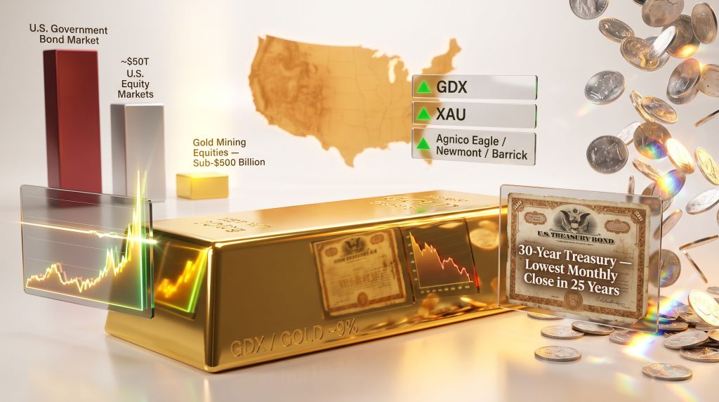
The current situation is categorically different. The deterioration now involves sovereign debt instruments, specifically US government bonds, which function as the foundational collateral of the entire global financial system. When the 30-year US Treasury futures contract records its lowest monthly close in 25 years, implying the highest long-term yields in a quarter century, the implications ripple far beyond domestic yield curves.
This gold-bond market reset challenges the credibility of the reserve asset that denominations trillions of dollars in global contracts, derivatives, and foreign exchange reserves. Unlike private sector defaults, which can be restructured through courts and negotiated write-downs, sovereign debt distress has no clean resolution mechanism.
The only available tool, historically and structurally, is monetary expansion. Governments facing the choice between defaulting on sovereign obligations or printing currency to service them have, without exception throughout history, chosen the latter.
The Trilemma Central Banks Cannot Escape
Monetary authorities currently face a structural impossibility: they cannot simultaneously suppress long-term yields, continue servicing existing debt, and maintain meaningful currency credibility. These three objectives are in direct conflict, and the mathematics of compounding debt means the tension only intensifies over time.
Japan has already signalled its posture explicitly, with policymakers acknowledging the need for continued monetary expansion regardless of inflationary consequences. This is not a fringe scenario. It is a template that US and European policymakers are quietly tracking. The US Treasury's bond buyback programme targeting longer-dated maturities has temporarily dampened yield volatility, but structural demand erosion continues beneath the surface.
Compounding this dynamic is the condition of private debt. Credit card delinquencies have now reached their highest levels since the aftermath of 2008, and commercial real estate debt remains acutely exposed to elevated long-term rates. The Federal Reserve is trapped. Raising rates further would accelerate private sector distress. Allowing long-term yields to rise freely threatens both the government's debt servicing capacity and the solvency of rate-sensitive asset classes.
The only pressure release valve available is monetary expansion, which means more currency units chasing the same pool of real assets. Economist Peter Schiff has publicly warned that the US Treasury market is breaking down, adding further weight to this structural concern.
The Scale Problem: Why a Bond Crisis Dwarfs Everything Else
| Asset Class | Approximate Market Size | Crisis Implication |
|---|---|---|
| US Equity Markets | ~$50 trillion | Sector-specific risk |
| US Government Bond Market | Larger than equities | Systemic, global contagion risk |
| Gold Market (global) | ~$14 trillion | Safe haven beneficiary |
| Gold Mining Equities | Sub-$500 billion | Highly leveraged upside exposure |
The US government bond market is larger than the domestic equity market. When distrust in sovereign paper spreads, even incrementally, the capital displacement effect into alternative stores of value becomes disproportionately large relative to the size of sectors like gold mining equities. A sub-$500 billion asset class absorbing even a fraction of capital fleeing a multi-trillion-dollar bond market creates outsized price dynamics. This asymmetry is central to understanding why the current macro environment is so potentially powerful for mining equities.
The GDX-to-Gold Spread: The Most Important Chart Almost Nobody Watches
Defining the Metric
The GDX-to-gold spread is calculated by taking the monthly closing price of the VanEck Gold Miners ETF and dividing it by the price of one ounce of gold on the COMEX nearby futures contract, expressed as a percentage. This ratio measures how mining equities are valued relative to the metal they produce. A complementary measure uses the Philadelphia Gold and Silver Index, which extends the historical dataset back to the 1980s.
This spread is a fundamental efficiency and sentiment gauge. When miners are operationally profitable at current gold prices but trade at a deep discount to the metal itself, the spread compresses. When capital recognises this mispricing and rotates into mining equities, the spread expands. The direction and magnitude of that expansion carries significant predictive information about gold and mining equities.
Thirteen Years of Compression: A Historical Anomaly
| Era | XAU-to-Gold Spread (Approx.) | Market Context |
|---|---|---|
| 1980 to 2008 | ~25% (range: 18% to 35%) | Multi-decade norm |
| 2015 (bear market low) | ~1% | Gold at $1,050; miners near collapse |
| 2024 to 2025 (current) | ~9% (GDX basis) | Still deeply below historical norms |
For the three decades spanning 1980 to 2008, the XAU-to-gold spread oscillated within a well-defined range, averaging approximately 25% with a floor near 18% and a ceiling near 35%. Following the commodity supercycle collapse, this spread began a prolonged compression that reached its nadir in late 2015, coinciding exactly with gold's bear market low of $1,050.
At that point, the spread had fallen to approximately 1%, a level that implicitly priced gold miners as nearly worthless relative to the metal they extract. Over the subsequent 13 years, the spread oscillated within a compressed low-valuation band, making three distinct approaches to the top of that range before retreating.
As of early 2025, the spread has broken above the top of this 13-year range on an intra-month basis for the first time. A confirmed monthly close above this resistance level would constitute a formal technical breakout, a signal that historically precedes rapid revaluation of undervalued mining stocks.
What a Confirmed Breakout Implies
The practical implications of this breakout extend well beyond chart aesthetics. Even a partial reversion toward the lower boundary of the pre-2008 historical norm at approximately 18% would imply roughly a doubling of current miner valuations relative to gold. In a scenario where gold itself continues advancing, miners could be positioned to appreciate at approximately twice the rate of bullion.
Crucially, the spread does not expand during declining metals markets. Historical analysis of every swing in the spread confirms that upward movements in the ratio occur exclusively during periods when gold is rising and miners are outperforming it. This means a spread breakout simultaneously signals two things:
- Mining equities are likely to outperform physical gold on a relative basis.
- The broader precious metals complex is likely entering an accelerated advance.
Key Insight: The GDX-to-gold spread is not widely tracked in mainstream financial media, yet it has historically provided one of the clearest early warning signals of major moves in the precious metals sector. Its current configuration, after 13 years of compression and three failed attempts to break out, represents a setup that technical analysts would recognise as unusually high-conviction in any other asset class.
Are Gold Miners Fundamentally Undervalued at Current Gold Prices?
The Cash Flow Disconnect
With gold trading at or near all-time highs above $4,600 per ounce, major gold producers are generating profit margins that are dramatically wider than their cost structures, which were established in a much lower price environment. Producers including Agnico Eagle, Newmont, and Barrick have seen earnings revisions accelerate sharply upward, yet equity valuations have persistently lagged the metal's appreciation.
On standard fundamental metrics, gold miners screen as deeply undervalued relative to both their own historical averages and the broader equity market:
- Free cash flow yield is at multi-year highs relative to equity price.
- Price-to-NAV ratios remain compressed despite the dramatic improvement in underlying metal prices.
- EV/EBITDA multiples are well below levels that would be expected given current profitability.
This fundamental mispricing is the mirror image of the technical spread compression discussed above. Furthermore, the two observations reinforce each other: miners are cheap on a technical relative-value basis and cheap on an absolute fundamental basis simultaneously.
Why Has the Market Ignored This?
The persistence of this undervaluation has a structural explanation. Institutional capital has been overwhelmingly allocated toward technology and artificial intelligence narratives for the past several years. The traditional 60/40 portfolio model has systemically crowded out alternative asset exposure.
The chief investment officer of Morgan Stanley publicly acknowledged this shift months ago, suggesting a move toward a framework of 60% equities, 20% bonds, and 20% gold as a more appropriate modern allocation. That acknowledgement from a major institutional voice marks a significant shift in mainstream thinking.
The global gold mining equity sector represents a sub-$500 billion asset class. Even modest capital rotation from multi-trillion-dollar equity and bond markets can produce outsized price movements in a sector of this size. This is precisely the dynamic that creates the asymmetric upside potential currently visible in the spread analysis.
The Dollar Collapse Thesis: A Compounding Catalyst
DXY Breakdown in Progress
The US Dollar Index, dominated approximately 70% by the euro and Japanese yen, has been range-bound near the 98 to 99 level for roughly 12 months. However, momentum analysis indicates that a structural breakdown in the dollar's trend began in early 2025, with the index breaking downward through momentum support levels that had held for the preceding year.
A confirmed break below 97 on the DXY is widely viewed as the trigger for an accelerated decline, with technical targets potentially extending toward the 70 level or lower. Such a move would represent one of the most significant dollar depreciations in recent history. For gold and mining equities, a weakening dollar creates a dual amplification effect:
- Gold becomes cheaper in non-dollar currencies, expanding global demand and broadening the buyer base.
- Dollar-denominated commodity assets reprice upward in nominal terms as the measuring unit itself depreciates.
The Foreign Capital Withdrawal Risk
International investors holding US equities face a compounding loss scenario when the dollar weakens simultaneously with equity prices. Declining share prices combined with dollar depreciation erodes returns when converted back to home currencies, potentially triggering structural incentive for foreign capital repatriation. This dynamic would further pressure US equity markets while benefiting non-dollar and commodity-linked assets.
The combination of a weakening dollar, rising gold prices, and deteriorating US government bond credibility forms a mutually reinforcing macro environment for precious metals. Each element amplifies the others, creating a feedback loop that has historically been associated with extended and powerful bull markets in the monetary metals complex. Indeed, gold bulls have been vindicated as prices have roared back above $4,500, underscoring the strength of this thesis.
Does Gold Fall When Stock Markets Crash? Separating History From Myth
The 2008 Exception That Became a False Rule
The October 2008 single-month correction in gold, which took prices from above $1,000 down into the $600s, is frequently cited as evidence that gold follows equities lower during broad market dislocations. This narrative does not survive contact with the full historical record.
The S&P 500 peaked in October 2007. Gold was already rising throughout the entire 12-month equity decline that followed. Gold's October 2008 correction lasted precisely one month, after which it reversed immediately following the Federal Reserve's quantitative easing announcement. Gold returned to new highs within months. The S&P 500 did not recover its 2007 peak until approximately 2013, nearly five years later.
A Broader Historical Record
| Period | S&P 500 Performance | Gold Performance |
|---|---|---|
| 2000 to 2002 (dot-com collapse) | -50% (S&P), -82% (Nasdaq 100) | Rose throughout the period |
| 2007 to 2009 (GFC) | -55% peak to trough | Rose overall; one-month correction in Oct 2008 |
| 1929 to 1932 (Great Depression) | -80% | Homestake Mining rose approximately 1,000% |
| 2025 (Recent equity selloff) | Significant weekly decline | Gold miners surged simultaneously |
The 1929 to 1932 case is particularly instructive. While direct gold ownership was eventually prohibited, Homestake Mining shares appreciated approximately 1,000% during a period when the broader stock market collapsed by 80%. The mining sector demonstrably did not receive the message that it was supposed to decline alongside equities.
Why the Liquidity Crunch Argument Fails Here
The common objection is that severe liquidity crunches drag all assets lower simultaneously. This argument underestimates the asymmetric size dynamics at play. Gold mining equities represent a tiny fraction of total equity market capitalisation. A small percentage of capital fleeing a multi-trillion-dollar equity market is sufficient to generate outsized price movements in an asset class measured in the hundreds of billions.
This is the dynamic sometimes described as the wet bar of soap effect: minimal buying pressure applied to an illiquid, underowned, and fundamentally mispriced sector produces disproportionate upside velocity. Silver miners and junior producers are even more acutely exposed to this mechanism given their smaller market capitalisations and thinner liquidity profiles.
The next major ASX story will hit our subscribers first
Gold's Price Trajectory: What Historical Bull Markets Suggest
Two Prior Cycles as a Framework
| Bull Market Cycle | Bear Low | Bull Peak | Magnitude | Duration |
|---|---|---|---|---|
| 1976 to 1980 | ~$100 | $850 | ~8x | ~3.5 years |
| 2001 to 2011 | ~$260 | $1,920 | ~7.4x | ~10 years |
| Current (2015 to present) | $1,050 | $4,600+ | ~4.4x so far | ~10 years ongoing |
The current bull market has achieved approximately half the percentage gain of each of the two prior cycles, despite occurring against a backdrop of far more severe fiscal and monetary deterioration. Both previous bull markets delivered roughly eightfold gains from their bear market lows.
Applying the same magnitude to the 2015 bear low of $1,050 would imply gold prices in the $8,000 to $9,000 range simply to replicate historical precedent, without accounting for the additional monetary expansion, sovereign debt stress, and collapsing bond market credibility that characterise the US government bond crisis and gold miners breakout environment today.
Measuring Gold in Real Terms: The M2 Lens
When gold's price is measured against cumulative M2 money supply growth rather than nominal dollars, the current price level reflects significant undervaluation relative to the quantity of currency in existence. This is not an abstract observation. Consider that the median US home price has moved from approximately $4,500 in one generation to $45,000 in the next to $450,000 today. This is not wealth creation. It is monetary unit degradation rendered visible through asset prices.
Gold has outperformed the S&P 500 on a real, money-supply-adjusted basis over the past 25 years. The S&P, measured against M2 growth over the same period, has essentially kept pace with monetary expansion but not exceeded it in real terms. Investors who believe they have made significant real returns in equities over this period may be measuring their gains in a depreciating unit.
Silver: The Most Explosive Asset in the Precious Metals Complex
Five Decades of Compression
| Metal or Commodity | 1980 Price | Current Price (Approx.) | Percentage Change |
|---|---|---|---|
| Gold | $850 | $4,600+ | +440%+ |
| Copper | ~$1/lb | ~$4 to $5/lb | +400% to 500% |
| Lead and Zinc | Historical reference levels | 4x to 6x 1980 levels | +300% to 500% |
| Silver | $50 | ~$32 to $35 | Marginally above 1980 high in nominal terms |
Silver's current price remains only marginally above its 1980 nominal high of $50, a performance that dramatically underperforms every comparable commodity and monetary metal over the same 45-year period. Gold has appreciated more than fourfold since 1980. Copper, lead, zinc, and other industrial metals have appreciated four to six times their 1980 levels. Silver has done almost nothing in nominal terms, and significantly less in real purchasing-power terms.
Silver broke decisively above the $50 resistance level in late 2024, a 50-year technical ceiling that had contained price action across two prior peaks in 1980 and 2011. That breakout, if sustained, removes the structural overhead that suppressed price discovery for generations. Persistent silver supply deficits over approximately six consecutive years add further fundamental weight to this structural case.
The $500 Silver Scenario: How the Math Works
The $500 silver thesis is not rooted in speculation. It emerges from two independent analytical frameworks that arrive at similar conclusions:
-
Relative performance normalisation: If silver were simply to match the relative performance of comparable industrial and monetary metals since 1980, a four to six times multiple applied to the $50 reference price produces a target range of $200 to $300. Matching gold's appreciation from that same starting point implies a price closer to $220 to $250. These are normalisation scenarios, not aggressive projections.
-
M2 money supply adjustment: Applying cumulative M2 money supply growth since 1980 to silver's 1980 peak price of $50 produces a purchasing-power-adjusted target of approximately $500. This represents what $50 silver in 1980 would need to be priced at today simply to maintain constant real value relative to the quantity of money in existence.
Adding structural complexity to this already compelling setup is silver's supply deficit. Mine supply has failed to meet demand for approximately six consecutive years, yet this fundamental imbalance has been largely ignored by mainstream institutional investors.
The Slingshot Effect: Markets that experience artificial suppression for extended periods frequently do not simply revert to fair value when constraints are removed. They overshoot in proportion to the duration and severity of the suppression. A five-decade compression in silver prices, combined with a structural supply deficit and an acute monetary crisis, creates the conditions for one of the most significant mean-reversion events in commodity market history.
Silver vs. Gold: Why the Spread Favours Silver Now
The gold-silver ratio analysis measures how many ounces of silver are required to purchase one ounce of gold, and it remains at historically elevated levels. This indicates silver is cheap relative to gold on a structural basis. Historically, periods when the gold-silver ratio compresses, with silver outperforming gold, have coincided with the most accelerated phases of precious metals bull markets.
Combined with the GDX-to-gold spread breakout discussed earlier, a silver outperformance thesis creates a layered, high-conviction positioning framework for investors already engaged with the precious metals sector.
The Broader Commodity Rotation: Where Capital Is Moving
Bloomberg Commodity Index: A Decade of Underperformance Creates Opportunity
| Timeframe | Bloomberg Commodity Index Level | Context |
|---|---|---|
| 2008 peak | ~235 | Commodity supercycle high |
| 2020 low | Below 60 | 12-year, 75%+ collapse |
| Early 2022 | ~140 | First recovery wave |
| Late 2024 (buy signal) | ~107 | Second major entry point |
| Current | ~140 | Still 40%+ below 2008 levels |
Commodities as a broad asset class remain significantly below 2008 levels in nominal terms and dramatically below those levels in real, money-supply-adjusted terms. A buy signal issued in October 2024 at approximately 107 on the Bloomberg Commodity Index has already generated meaningful returns, but the structural upside case remains intact. The fact that the equity market has been making new highs while commodities trade at less than half their 2008 peak levels in nominal terms reflects an extraordinary divergence in relative valuation.
Oil and Platinum: Important But Distinct Stories
WTI crude oil broke out from a momentum perspective in January 2025, approximately three months after the broader commodity complex turned upward. At current prices, oil remains well below prior cycle highs in both nominal and real terms. The oil sector ETFs including XLE, XOP, and OIH demonstrated relative resilience during the war-driven price spike and subsequent collapse, a constructive technical sign indicating institutional accumulation rather than speculative momentum chasing.
Platinum presents a different but related case. Its price behaviour correlates more closely with the Bloomberg Commodity Index than with gold or silver. After prolonged underperformance relative to gold, platinum began showing technical breakout characteristics in early 2025. However, platinum is better understood as a commodity with precious metal characteristics rather than a monetary metal. In the current environment, where the underlying crisis is fundamentally monetary in nature, gold and silver offer more direct exposure to the core macro thesis.
The Financial Sector Warning Signal
Momentum Breakdown in Banks and Financials
The XLF Financial Select Sector ETF and the KBE Bank ETF had maintained consistent momentum support floors for approximately three months, with every pullback being absorbed at the three-week moving average. Recent price action shows both instruments breaking below these momentum floors, a signal that is not visible on standard price charts but is evident in momentum-based analytical frameworks.
This matters because the financial sector represents approximately 10% to 15% of S&P 500 weighting. A meaningful decline in financials, even of the order of 10%, would risk engaging longer-term momentum trend structures across the broader index. The S&P 500 and Nasdaq 100 cannot sustain approximately an 8% to 10% drop from recent levels without breaking annual momentum structures that have underpinned the multi-year bull market.
Why Financial Sector Weakness Reinforces the Gold Miners Thesis
The simultaneous occurrence of financial sector momentum breakdown and a breakout in the GDX-to-gold spread is not coincidental. It reflects large asset managers reassessing risk tolerance for equities and seeking alternative destinations. When those managers apply even basic fundamental analysis to gold mining equities at current gold prices, the cash flow generation, NAV discounts, and earnings trajectory make the sector a compelling destination.
When capital exits equities and finds bonds to be equally compromised, the remaining destination set is narrow: commodities, monetary metals, and the equities levered to them. The tiny size of the gold and silver mining sector relative to the sources of that capital displacement means that even a modest rotation produces dramatic price effects. This structural setup is precisely why the US government bond crisis and gold miners breakout represent one of the most consequential macro themes in 2025. This is the structural setup that currently exists.
Disclaimer: This article is for informational purposes only and does not constitute financial or investment advice. All projections, price targets, and scenario analyses referenced herein involve significant uncertainty and should not be relied upon as a basis for investment decisions. Past performance of any asset class is not indicative of future results. Readers should conduct their own research and consult a qualified financial advisor before making any investment decisions.
Want to Catch the Next Major ASX Mineral Discovery Before the Broader Market Does?
Discovery Alert's proprietary Discovery IQ model delivers real-time alerts on significant ASX mineral discoveries, instantly translating complex mineral data into actionable investment insights — explore the historic returns major discoveries have generated to understand the scale of opportunity, then begin your 14-day free trial today to position yourself ahead of the market.